Six industry-specific Figma templates with complete user flows, real business logic, and production-ready screens for every stage of your product.
6 Industry Templates
Healthcare, Fintech, Crypto, CRM, AI, Product Management. Each built as a complete product.
600+ Production Screens
Every module, every flow, every state. Designed to the level your engineers will actually ask about.
Lifetime Updates
Buy once. Every new vertical, screen, and flow added to Beyond UI is yours to keep.
FEATURES
Every screen exists in context - from onboarding to core workflows, settings to error states. You get a finished product to design from, not a component catalog to assemble.
Each vertical reflects how that product actually works. The flows, the data structures, the edge cases. Not a generic SaaS shell dressed up with an icon.
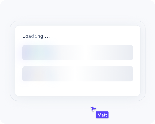
Loading, empty, error, success, partial data, zero results, bulk actions - all designed. The screens that get skipped in every other kit are the ones your engineers will ask you about on day one.
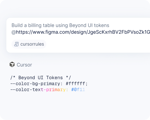
CSS tokens and a universal prompt ruleset ship with every template. Drop them into v0, Cursor, or Claude Code. Figma to frontend in minutes
AI App Template
120+ Screens
7 Flows
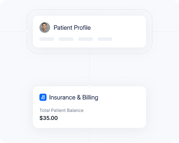
Healthcare App Template

190+ Screens
10 Flows
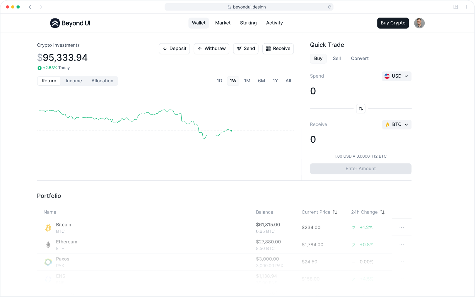
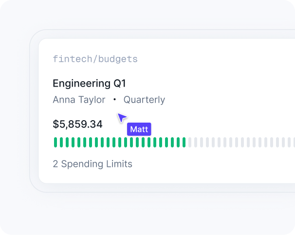
Finance App Template
130+ Screens
6 Flows
Product Management App Template
70+ Screens
5 Flows
Crypto Wallet App Template
100+ Screens
6 Flows
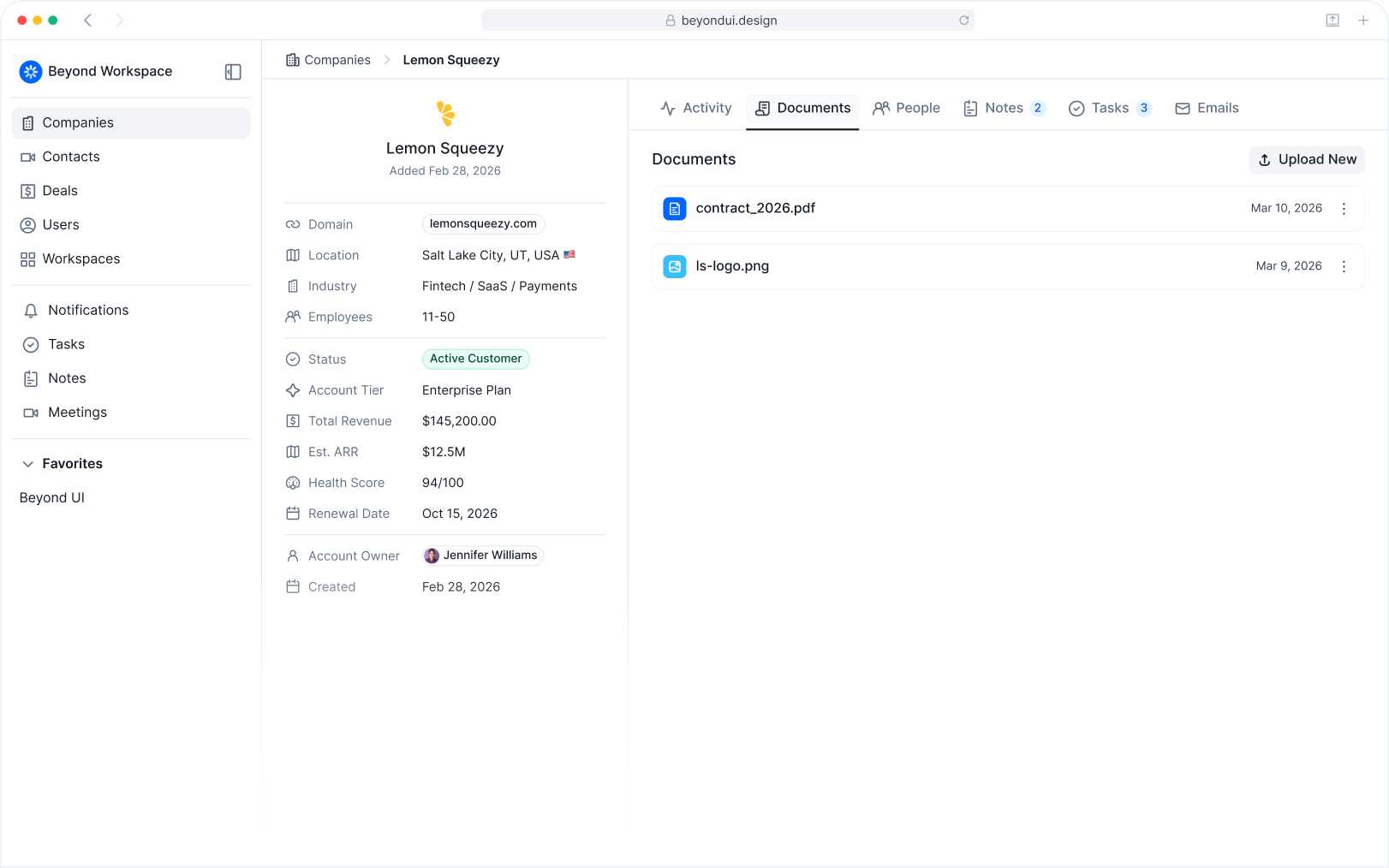
CRM App Template
40+ Screens
5 Flows
"Most healthcare tools look like they were designed in 2008. I wanted Zentium to feel like the opposite - clean, modern, a little bit beautiful. This kit got us there fast, without having to build out a dedicated design team."
Jack Kiley
Founder & CEO at Northpoint Labs · Founder & Builder at Zentium AI
“WoW. WoW. WoW. When I think about how many hours this UI kit saved me, my brain explodes! I love the dark and light mode playground files sooo much. Perfect for unlocking rapid creative thinking.”
Jovana Gojkovic
Founder at joindesign.cc
"Since switch to Beyond UI in its early days, I've seen a 5-10x boost in productivity, and a noticeable improvement in what I'm actually delivering to clients. It's become one of those UI kits I genuinely couldn't imagine working without."
Lazar Krstic
Product Designer at Studyflash


FAQs
We tried to address the most common questions related to Beyond UI.
If you have additional questions, please don't hesitate to contact our team.
General