


.png)
"Most healthcare tools look like they were designed in 2008. I wanted Zentium to feel like the opposite - clean, modern, a little bit beautiful. This kit got us there fast, without having to build out a dedicated design team."

Jack Kiley
Founder & CEO at Northpoint Labs · Founder & Builder at Zentium AI
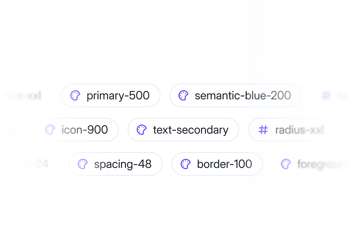

Figma Design System Foundations
A semantic token system for color, typography, spacing, and radius, with one-click dark mode across every component.
.png)

Premium Figma Components
9,000+ Figma components built on auto layout, nested instances, and variables, with every state covered from default to error.


Landing Page Sections
500+ responsive sections for headers, pricing, testimonials, and more. Drag and drop to ship a marketing site fast.
“WoW. WoW. WoW. When I think about how many hours this UI kit saved me, my brain explodes! I love the dark and light mode playground files sooo much. Perfect for unlocking rapid creative thinking.”

Jovana G.
Founder at joindesign.cc
SaaS Templates
Production-Ready SaaS Templates for Figma
Six fully structured SaaS templates built in Figma with real product logic. Designed with complete user flows, realistic data models, and a production-ready architecture for fast development handoff.
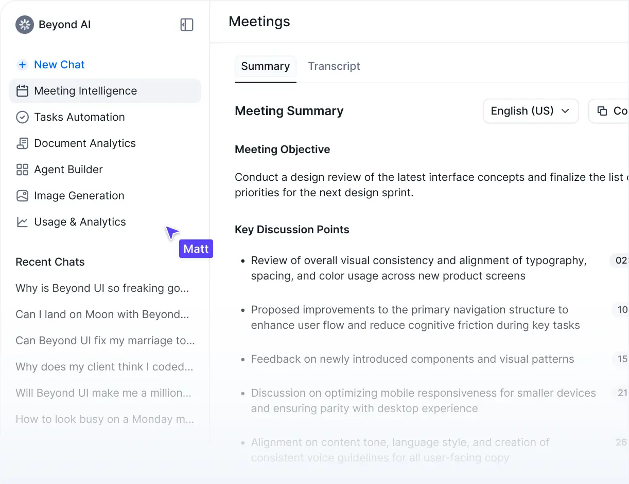
AI SaaS Template
AI SaaS template designed for AI tools and platforms. Built with real product logic, structured workflows, and scalable architecture to support everything from simple tools to complex AI platforms

Chat & Prompting
Meeting Intelligence
Task Automation
Document Analytics
Image Generation
Usage & Analytics

All templates included in Premium plan.
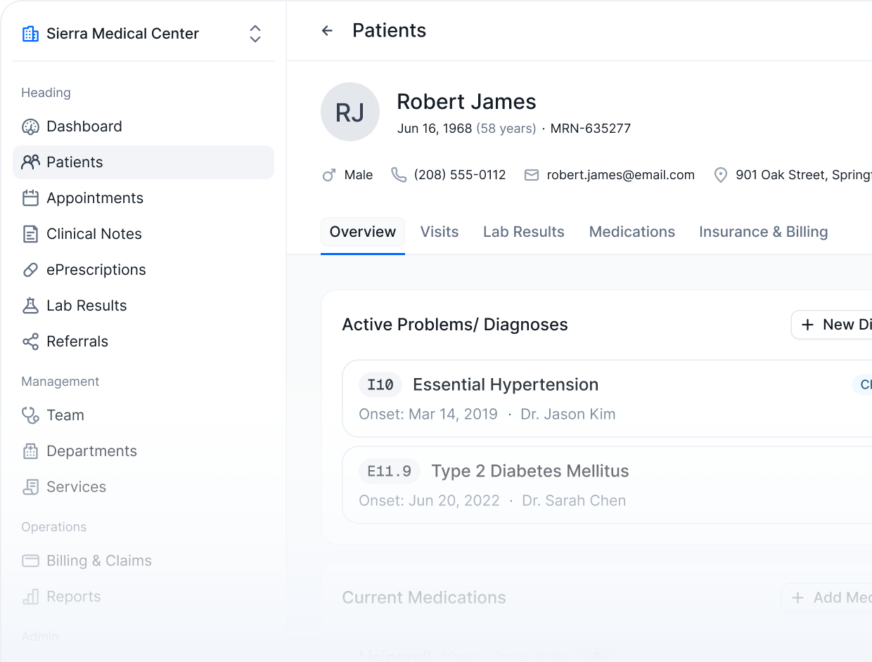
Healthcare SaaS Template
A production-ready Figma template for building modern healthcare platforms. Designed for clinics, practices, and care teams managing patients, workflows, and operations at scale.
Patients
Appointments
Clinical Notes
ePrescriptions
Lab Results
Referrals
Billing & Claims
All templates included in Premium plan.
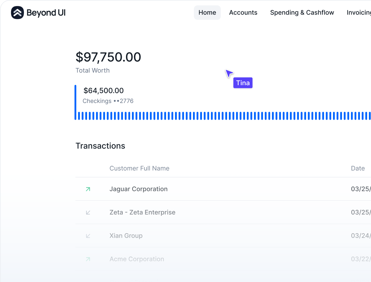
Fintech SaaS Template
Everything you need to design a powerful financial platform. Built for fintechs, banks, and finance teams handling money movement, invoicing, and spend management - end to end.
Accounts
Cards
Transactions
Invoices
Spending
Budgets
All templates included in Premium plan.
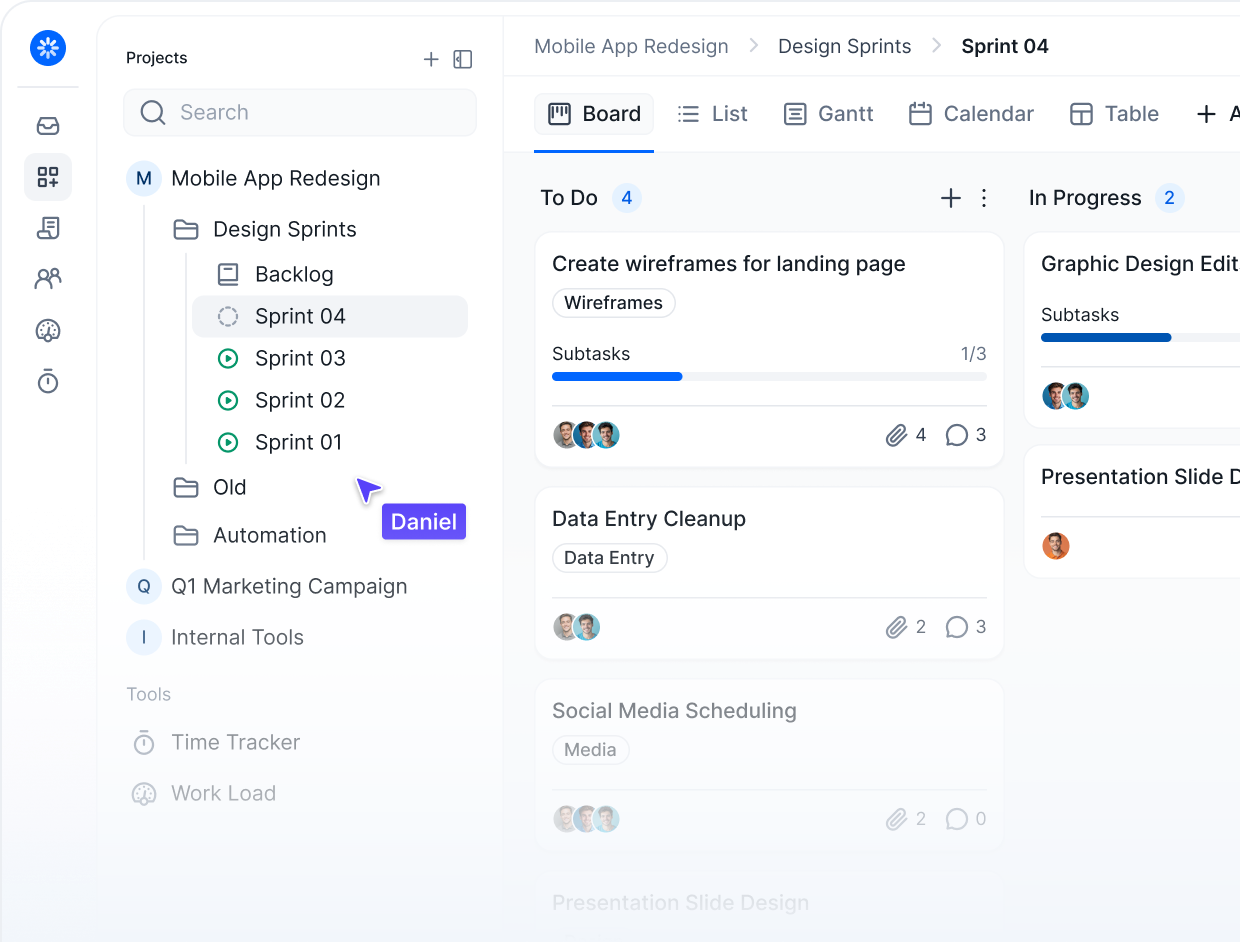
Project Management Template
A full-featured project management platform template for teams that need structure without compromise. Built around multiple views and real collaboration workflows
Task Management
Task Detail
Documents
Teams
Timesheets
All templates included in Premium plan.
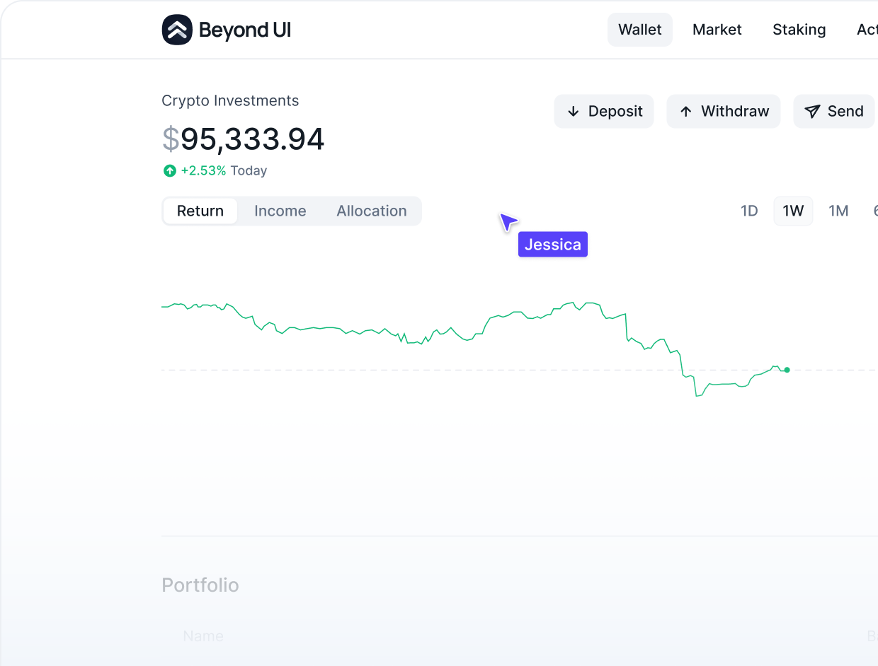
Crypto Wallet SaaS Template
A modern crypto platform template covering everything from portfolio management to trading. Designed for Web3 products that need clarity, speed, and real transactional logic.
Wallet
Market
Staking
Activity
Buy Crypto
Sell
Convert
All templates included in Premium plan.
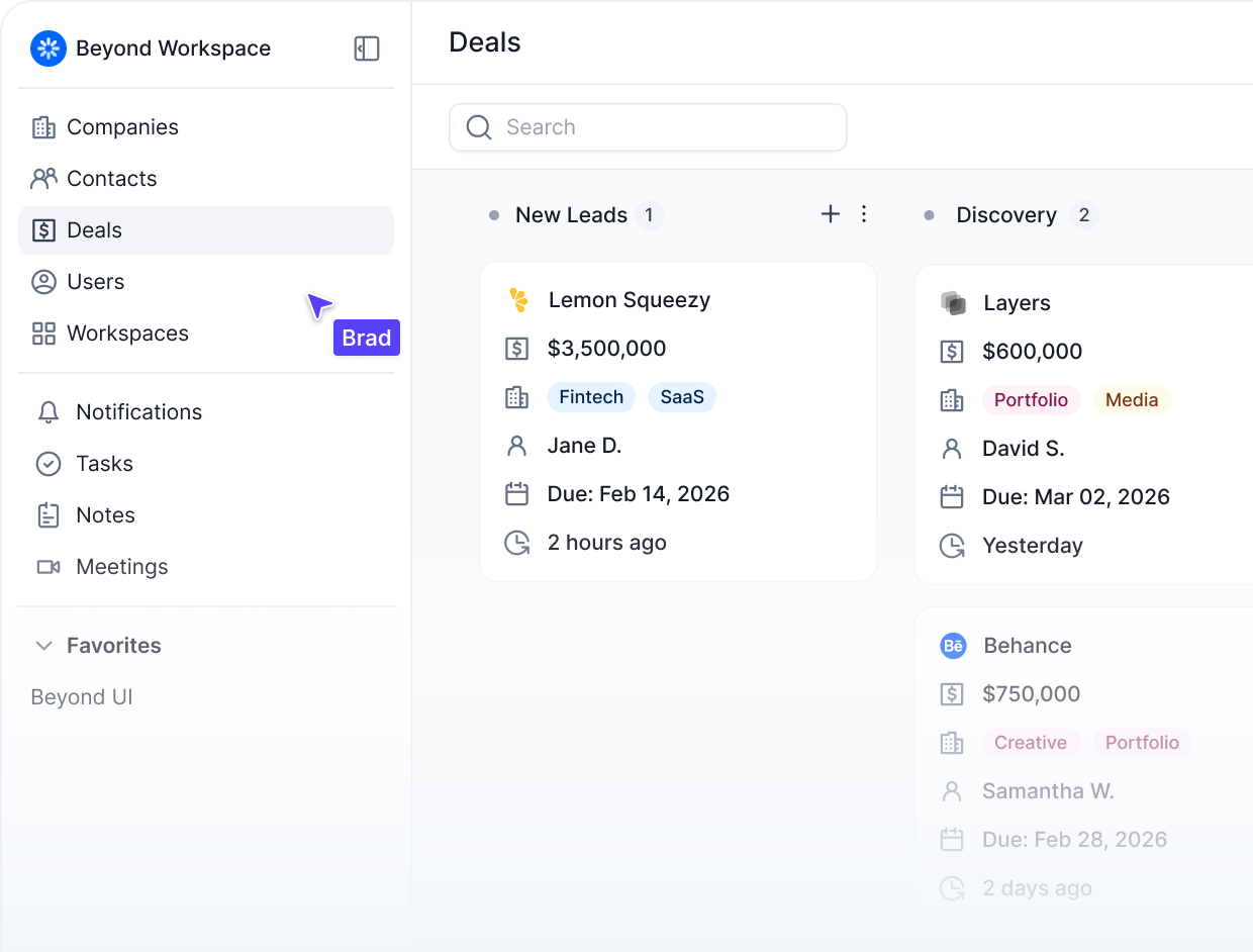
CRM SaaS Template
A clean, scalable CRM template for teams managing pipelines, relationships, and sales operations. Built with the data models and workflows that real go-to-market teams actually use.
Companies
Users
Contacts
Deals
Actvity
Documents
All templates included in Premium plan.
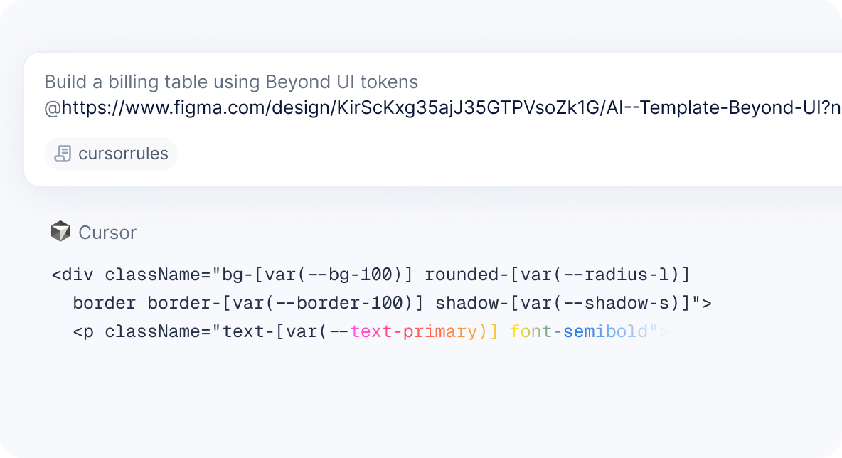
Vibe Coding
Give your AI editor something real to work with
Beyond UI ships with CSS tokens, Tailwind config, and ready-made rules files for Cursor and Claude Code in every plan. Less setup, more consistent output from your first prompt.

Junior Designers & Beginners
Starting with Figma? No worries, Beyond UI is ideal starting point for you!

Senior Designers
Get tools that match your expertise and let you focus on creativity

Freelancers
Save time and deliver polished results clients will love

Design Teams & Startups
Work smarter together and bring ideas to life faster.

Enterprises
Built to handle big projects without slowing you down

Auto layout & variables
Design-ready components that speed up your workflow
FAQs
Frequently Asked Questions
We tried to address the most common questions related to Beyond UI.
If you have additional questions, please don't hesitate to contact our team.
General