9,000+ production-ready components built with native Figma variables, auto-layout, and smart properties. Every component ships with all states, dark mode, and responsive behavior. Ready to use, easy to customize.
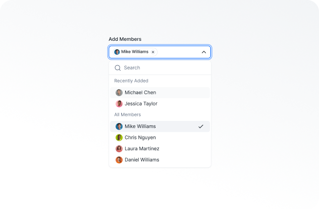
9,000+ Components
Every UI pattern you need - inputs, modals, tables, charts, and more. Built once, reused everywhere.
Auto Layout
Components that flex and adapt like real code. Resize, stack, and align without breaking.
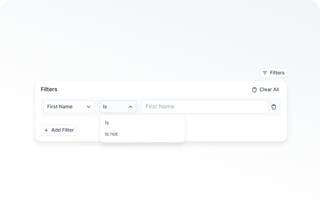
All States Included
Default, hover, focus, disabled, and error states - covered on every single component.
Smart Components
One master component, thousands of combinations. Powered by native Figma component properties.
Dark Mode
Full dark mode support out of the box. Switch themes instantly with Figma variables.
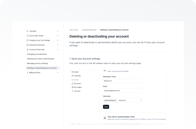
SaaS Specific Components
Charts, data tables, dashboards, and complex UI patterns built for real product workflows.
✦ Beyond UI Components
The foundation of a design system includes elements like color, typography, shadows, icons, and spacing. Its complexity varies based on the organization's size or product dimensions.
✦ Beyond UI Components
Premium, smartly crafted UI components. Everything you need for next design project.
✦ Beyond UI Components
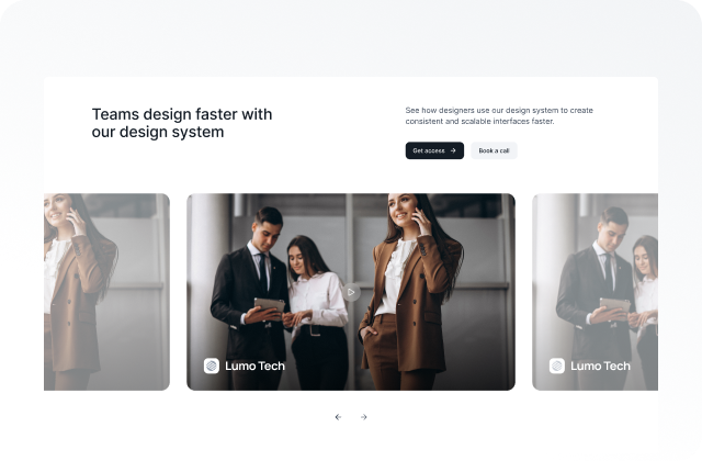
Most used product components, sections and screens
✦ Beyond UI Components
Including slots, custom-made website section components and screens. Available in dark mode and three device sizes.
✦ Beyond UI Components
The foundation of a design system includes elements like color, typography, shadows, icons, and spacing. Its complexity varies based on the organization's size or product dimensions.
✦ Beyond UI Components
The foundation of a design system includes elements like color, typography, shadows, icons, and spacing. Its complexity varies based on the organization's size or product dimensions.
✦ Beyond UI Components
Most used product components, sections and screens.
✦ Beyond UI Components
The foundation of a design system includes elements like color, typography, shadows, icons, and spacing. Its complexity varies based on the organization's size or product dimensions.
"Most healthcare tools look like they were designed in 2008. I wanted Zentium to feel like the opposite - clean, modern, a little bit beautiful. This kit got us there fast, without having to build out a dedicated design team."
Jack Kiley
Founder & CEO at Northpoint Labs · Founder & Builder at Zentium AI
“WoW. WoW. WoW. When I think about how many hours this UI kit saved me, my brain explodes! I love the dark and light mode playground files sooo much. Perfect for unlocking rapid creative thinking.”
Jovana Gojkovic
Founder at joindesign.cc
"Since switch to Beyond UI in its early days, I've seen a 5-10x boost in productivity, and a noticeable improvement in what I'm actually delivering to clients. It's become one of those UI kits I genuinely couldn't imagine working without."
Lazar Krstic
Product Designer at Studyflash


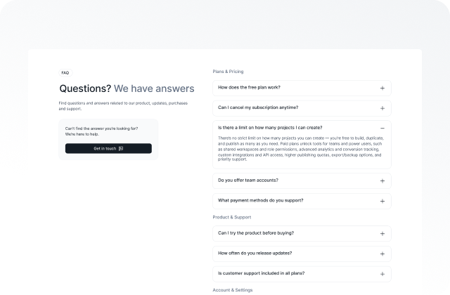
FAQs
We tried to address the most common questions related to Beyond UI.
If you have additional questions, please don't hesitate to contact our team.
General


