
Changelog
∙
Jul 21, 2026
∙
5 minutes
Foundations get a cleanup, most of the library gets an update, and every complex component now has proper docs.

Beyond UI 4.1 just shipped. This release focuses on the foundations. Variable structure was cleaned up, typography variables that were missing in 4.0 were added, most of the component library got updates ranging from small refinements to full refactors, and every complex component now ships with a Guidelines and Anatomy page. Existing Standard and Premium customers get 4.1 as a free update.
Here is what changed.
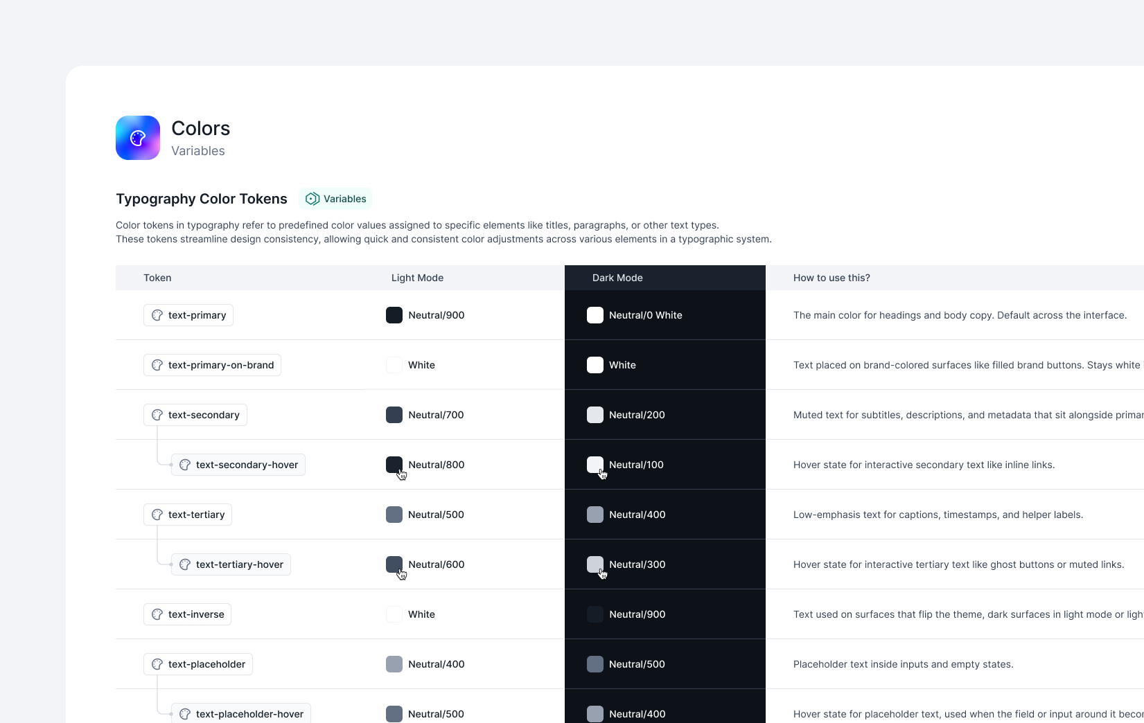
The variable structure was reorganized. Color coverage is the same as 4.0, but tokens were renamed for cleaner, more predictable syntax that reads better in Figma and produces better output in AI codegen tools. Naming is consistent across all three layers (primitives, semantic, applied), so switching between them no longer requires guessing.
On the typography side, new variables were added that were missing in 4.0. Font family, weights, and text scale now live as variables. Change the font family variable once, and apply it to every text style across the kit updates.
Most of the library got attention this release, not just the Menu family. Here is what moved.
Buttons. Added a Loading state, and an inner text wrapper with 4px horizontal padding so the spacing between the label and the button edge feels natural, especially at smaller sizes and next to icons.
Input. Left Side and Right Side were renamed to Left Area and Right Area. Avatar was added to the Left Area Base options.
Dropdown. Now uses Menu Item and Menu Group as shared core components. The Label boolean in variants was cleaned up.
Combobox. Now uses Menu Item and Menu Group as shared core components, matching Dropdown.
List. Now composed of Label and Helper Text with swappable Left and Right Areas. The old Checkbox Card was folded into List Item, so there is one component to reach for instead of two.
Badges. Split into three separate master components: Label Badge, Count Badge, and Icon Badge.
Accordion. Now composed of Label and Helper Text core components, matching the pattern used across the rest of the library.
Slider. Turned into a master component with its own sub-elements (Icons, Text Inputs), so slider layouts stay consistent no matter which variant you drop in.
Tabs. Added a Count Badge boolean, so tab labels can show a count inline without a manual layout.
Menu (Core Component). New. Menu is now the shared base for Dropdown, Combobox, and Sidebar Menu. Menu Item and Menu Group are the two core sub-components that everything on top inherits.
Label (Core Component). Added a Large (16px) size and a Badge boolean, so labels can carry an inline tag when needed.
Sidebar Menu. Paddings were fixed, and it now uses Menu Item and Menu Group as shared core components alongside Dropdown and Combobox.
SaaS Navigation. Slot handling was improved.
SaaS Starting Templates. Minor layout bugs across templates were fixed.

Every complex component now ships with a Guidelines and Anatomy page inside the Figma file. Anatomy diagrams label each part of the component so you can see, at a glance, what a Menu Item is composed of, where Helper Text lives on an Input, or how a Combobox Input Field relates to its Opened Container. Guidelines cover what the component is for, how it is built, which sub-components it uses, what each property does, and when to reach for one variant over another.
This is the layer that turns a kit into a design system.

Vibe coding assets were regenerated against 4.1. The CSS token files (color primitives, semantic, applied, typography, spacing, effects) match the 4.1 Figma variables one-to-one. The Tailwind config exposes the same applied tokens as utility classes. The rules files (.cursorrules, CLAUDE.md, and a universal rules file) were rewritten to use the new token vocabulary and naming conventions.
Nothing renders as a broken reference in the browser, and AI editors get the right token names from the first prompt.
4.1 sharpens what Beyond UI already was. Cleaner tokens, shared core components under Dropdown, Combobox, and Sidebar Menu, and docs that explain the reasoning behind each component instead of just showing the pieces. If you build on Beyond UI every day, the difference should show up in how fast the small decisions get made.
More coming soon.

Share post


