
Resources
∙
14 Jan, 2026
∙
7 minutes
A compilation of the most carefully crafted UI kits and design systems for UI/UX designers that will speed up your work in Figma.
Companies trying to create consistent digital experiences for their customers have to make hundreds of design decisions every day. Instead of approaching each decision on a one-off basis, Design Systems, Wireframe and UI kits provide repeatable solutions to common design problems, like what font to use, where to place an image, or how an entire website can meet accessibility standards. A systems approach to design reduces the number of one-off decisions people need to make and creates more consistent results.
This is a collection of reusable components with clearly defined standards for use. These components combine pattern libraries, colors, and fonts with standardized design principles to help companies achieve consistent visual design at scale. Design systems embed these building blocks of design into teams and workflows to create consistent user experiences even when design is distributed among numerous designers and other creators.
.webp)
Beyond UI is a premium Figma UI kit and design system built specifically for SaaS products and landing pages. With 9,000+ components and 6 fully designed SaaS templates (AI App, Healthcare, Fintech, CRM, Project Management, and Crypto Wallet), Beyond UI gives designers everything needed to ship production-ready interfaces fast.
What sets Beyond UI apart is its modern architecture. Built with Auto Layout 7.0, nested instances, and 650+ variables and tokens, designers can build entire SaaS apps from a few master components. The nested instances approach allows thousands of variations from minimal master components, resulting in faster page management and cleaner files.
Beyond UI is also the first Figma kit truly built for AI vibe coding workflows. It ships with ready-made rules files for Cursor and Claude Code, plus exported CSS tokens and Tailwind config, so developers can go from Figma to production code without manual translation.
Dark mode and responsive layouts work with a single click thanks to native Figma variables.
Standard license starts at $119 for a single user, with Premium at $249 unlocking all six SaaS templates. Team and Enterprise licenses available.
Beyond UI is a great starting point for any designer, suitable for projects ranging from simple to complex.
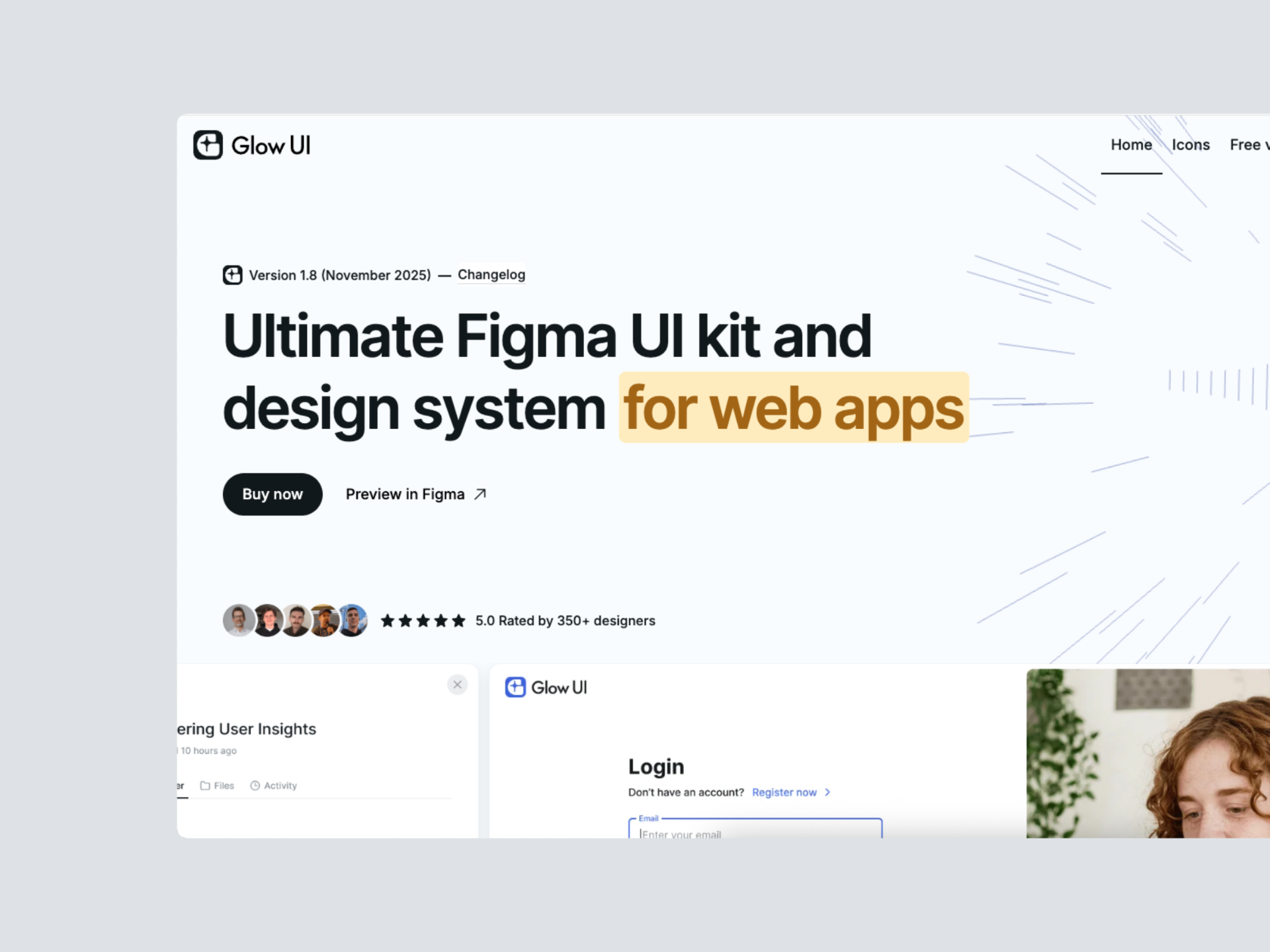
Built by Alexey Likhobabin, Glow UI is an advanced Figma UI kit and design system designed for creating web applications, SaaS, and admin dashboards. Constantly updating, Glow UI takes a refined approach to component architecture, with everything based on variables rather than styles, and uses the modern APCA contrast algorithm for accessible color palettes. Its standout feature is a custom multi-theming system that lets you switch between light, dark, and wireframe modes in a single click.
Glow UI is built with 100% Auto Layout 5.0 and Atomic Design Principles, including 6,500+ components and variants, 1,200+ variables and styles, 40+ responsive templates with mobile versions, and 440+ custom-made icons. The library is lightweight at only 28 MB for fast loading and is regularly updated with the latest Figma features released at Config and Framework events.
Glow UI comes with Free and Pro versions, with the Pro version starting at $72 per user for 1 to 15 users, including unlimited project usage and lifetime free updates.
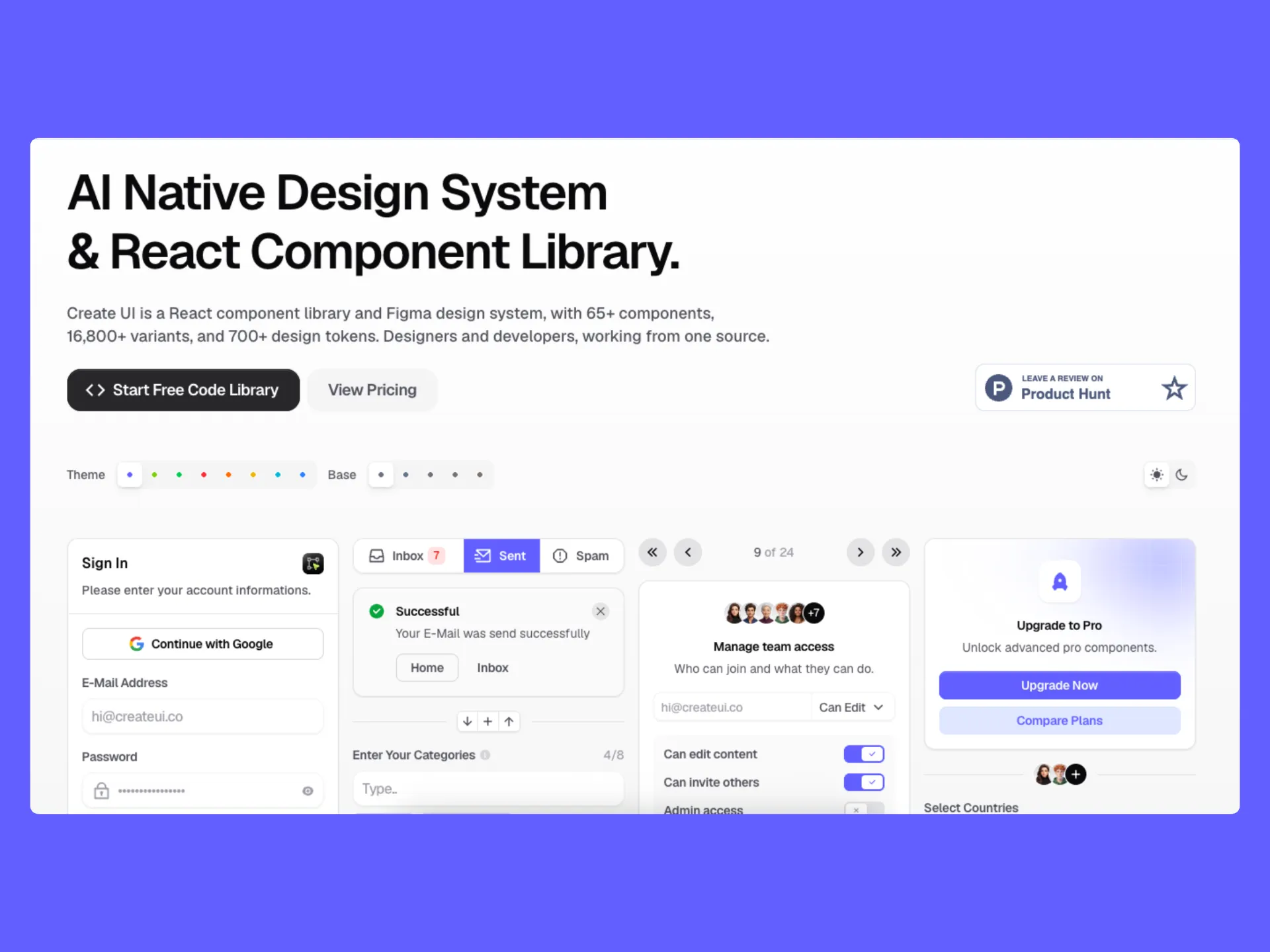
Create UI is a v1.0 launch (2026) from a Turkish team, and one of the few design systems that explicitly positions itself as AI-native. Every plan ships with .md AI Context Files, and the Pro Code Library includes MCP integration and dedicated AI Skills, giving Cursor, Claude Code, and other agents structured context to generate matching UI code from the system.
The library covers 65+ components with 16,800+ variants and around 950 design tokens, structured for both a Figma design system and an installable React component library that stay in sync. The tech stack combines React, Tailwind CSS, and Radix UI primitives, with Remix icons and 20+ prebuilt themes covering every accent color in light and dark modes. Components are fully responsive across desktop, tablet, and mobile out of the box, with tokens syncing from Figma directly into code.
Create UI splits its plans by workflow rather than seat count, so designers can buy just the Figma file, developers can buy just the code library, or teams can buy the unified bundle. The pricing structure below reflects the v1.0 launch promotion.
Pricing (one-time payment, lifetime updates, single user, currently 50% off for v1.0 launch):
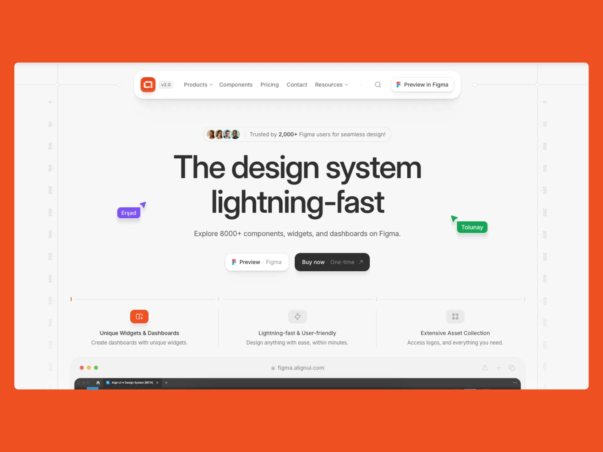
Launched in December 2023 by Erşad Başbağ, Melis Bıyıkçı, and Kerem Yıldan, AlignUI is a modern design system built around dashboards and SaaS interfaces. Now on v2.0, the library includes 7,800+ components, 1,200+ assets, 80+ unique widgets, and sector-specific templates for HR Management, Finance & Banking, Marketing & Sales, and AI products, which few competitors offer.
What sets AlignUI apart is the 1:1 sync between its Figma file and a matching React + Tailwind CSS code library. Components in Figma map directly to code, closing the design-to-development gap that most Figma kits leave open. AlignUI also maintains a free open-source library of 40+ base React components at alignui.com, separate from the premium ecosystem.
Pricing (one-time payment, lifetime updates):
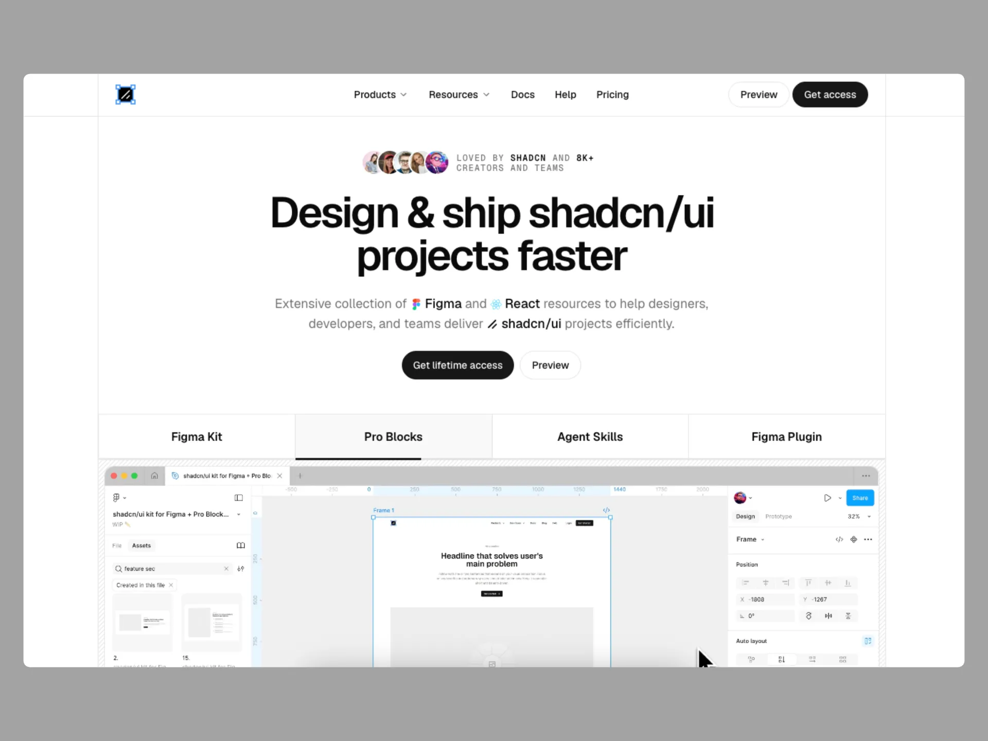
Built by Matt Wierzbicki, this is the only shadcn/ui-based Figma kit officially endorsed by the creator of shadcn/ui himself, who called it "the ultimate Figma kit for shadcn/ui." Wierzbicki previously maintained the Ant Design System for seven years.
All 8 shadcn/ui styles (Nova, Vega, Mira, Luma, Sera, Maia, Rhea, Lyra) ship in a single Figma file, and switching one variable mode restyles the entire document. The library covers 2,000+ components, a Typeset system for long-form prose, and multi-brand support. It's fully compatible with Tailwind v4, Radix UI, Base UI, and the Vue and Svelte implementations of shadcn/ui.
The ecosystem extends well beyond the Figma file. Pro Blocks install directly via the shadcn CLI, giving developers production-ready React code that matches the designs one-to-one. A Figma plugin generates shadcn/ui code from any frame using Claude, Gemini, or v0. Agent Skills teach Claude Code, Cursor, Codex, and OpenCode how to handle Figma-to-code tasks, and a dedicated Academy covers the full workflow.
Pricing (Personal License, one-time payment, lifetime updates):
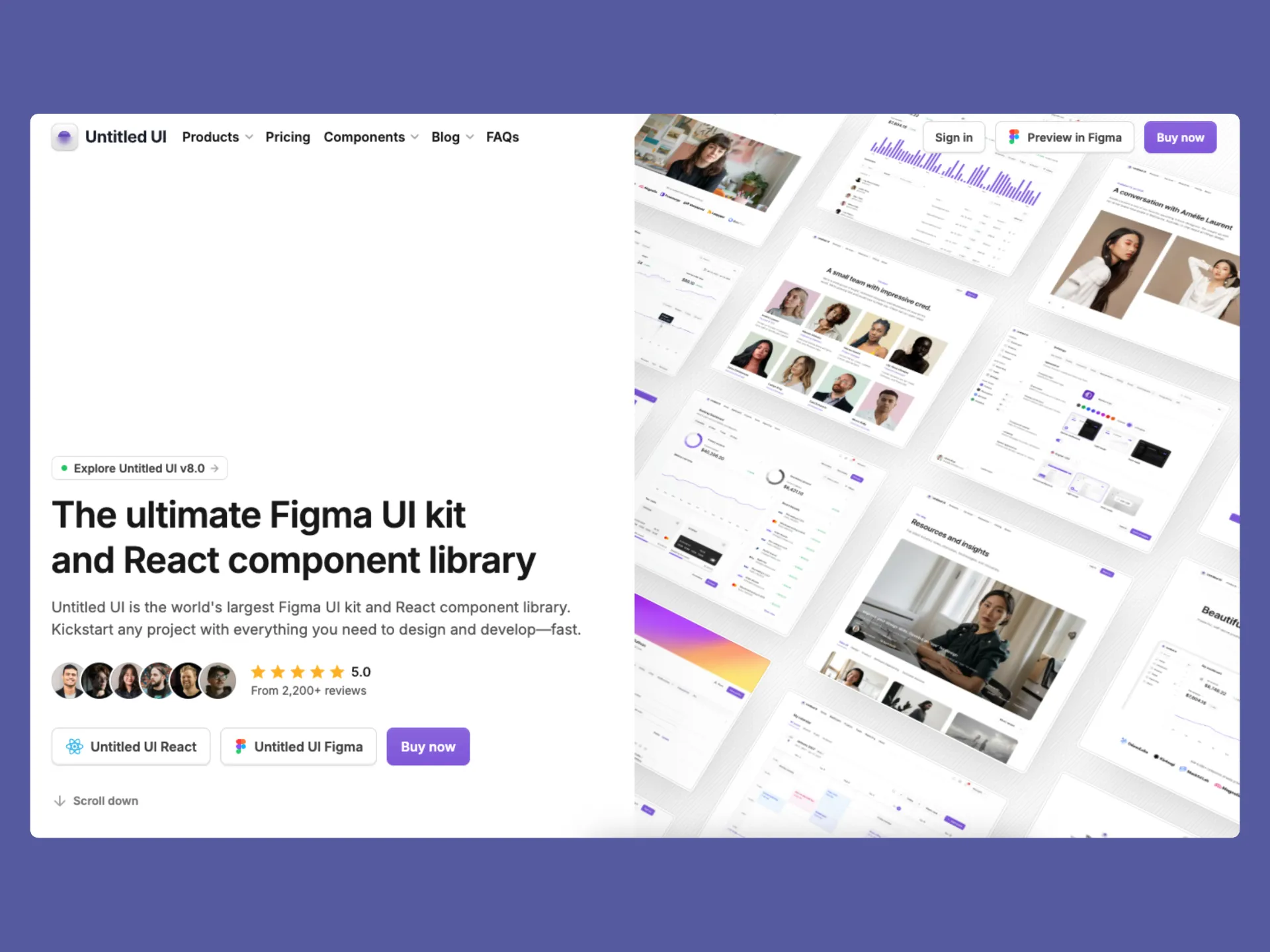
Untitled UI by Jordan Hughes is the largest and most established Figma UI kit on the market, currently on v8.0 with 380,000+ designers using it. The library covers 10,000+ components and variants, 900+ global styles and variables, 420+ page design examples, and 2,000+ icons and logos.
The Figma kit ships in three versions in a single purchase: PRO VARIABLES (full variables and Auto Layout 5.0), PRO STYLES (same features without variables for a simpler workflow), and PRO LITE, a lightweight version the team describes as 55% lighter and faster, since the full library's scale can strain older machines. Alongside the Figma kit, Untitled UI offers a separate React component library built on React v19.2, Tailwind CSS v4.3, TypeScript, and React Aria, plus a dedicated icon library with 4,600+ icons.
Given how long the kit has been on the market, its design language leans toward a proven, established aesthetic rather than the latest trend, a strength for teams that want a stable foundation, though designers chasing a more current look may prefer alternatives.
Pricing (one-time payment, lifetime updates):
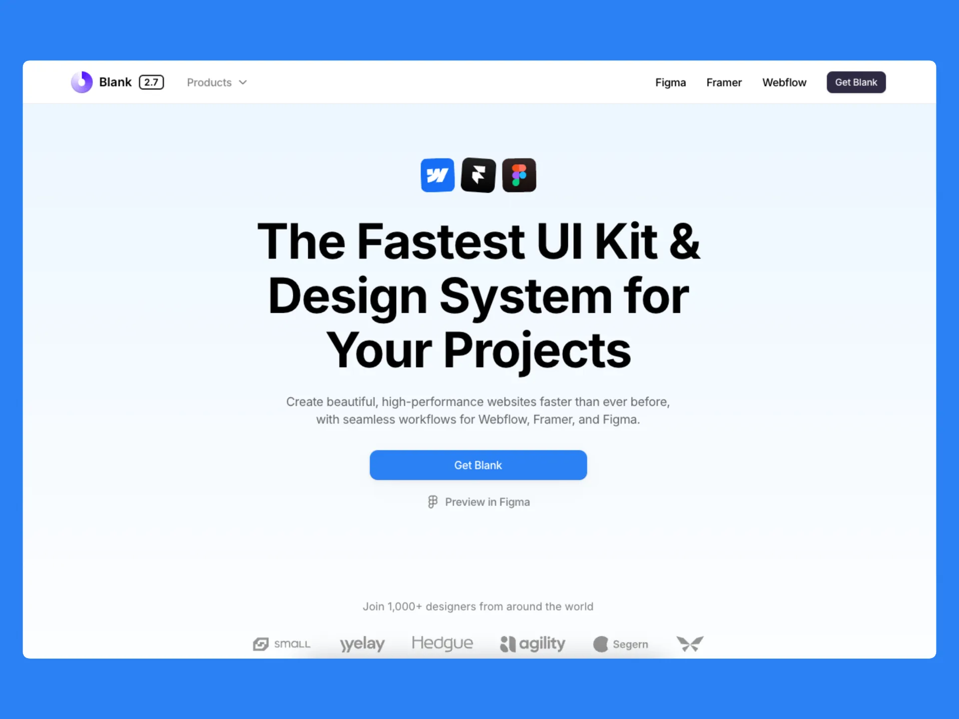
Blank UI is a Figma UI kit and design system built by Craftwork Design, currently on v2.7. It is aimed at teams who need to move quickly across Figma, Framer, and Webflow with the same underlying design language, and ships with parallel component sets for all three platforms.
The Figma library covers 3,200+ components, 300+ variable tokens, 150+ ready-to-use layouts, and 2,500+ Remix icons in outline and solid styles (free for commercial use). Components use the latest Auto Layout and Figma variables, with dark and light modes handled through a single variable switch. Blank is a good pick for designers who want a cross-platform starter kit rather than a heavy full-scale design system.
Pricing (one-time payment, lifetime updates, single user):
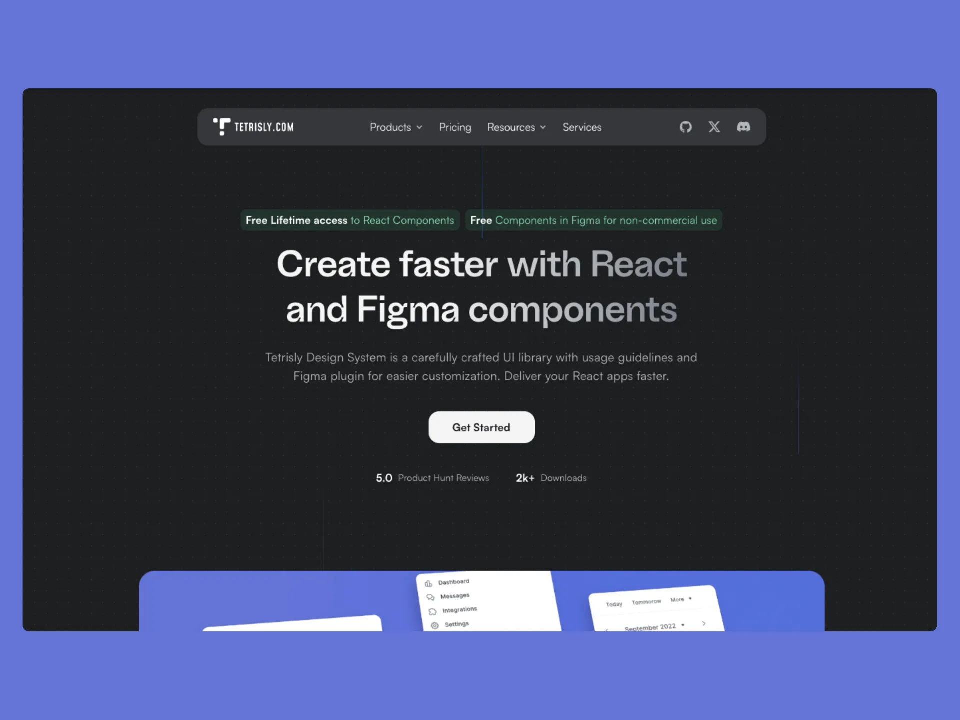
Tetrisly is a Figma design system built by Patryk Illnicki and Andrzej Miałszygrosz at VirtusLab. It takes a token-first approach: every component is prepared with semantic color aliases and variables, and ships with a free Figma plugin (Design System Tool) for managing tokens.
A React library is also available at github.com/VirtusLab/tetrisly-react for full design-to-code sync.
The Figma library includes 50+ unique components (570+ counting variants and primitives), 681 color variables (aliases and globals), 54 number variables for spacing, sizing, and radius, 24 typography compositions, and 360+ icons. Documentation is embedded in the file and available at docs.tetrisly.com.
Pricing (annual subscription for commercial use, free for non-commercial):
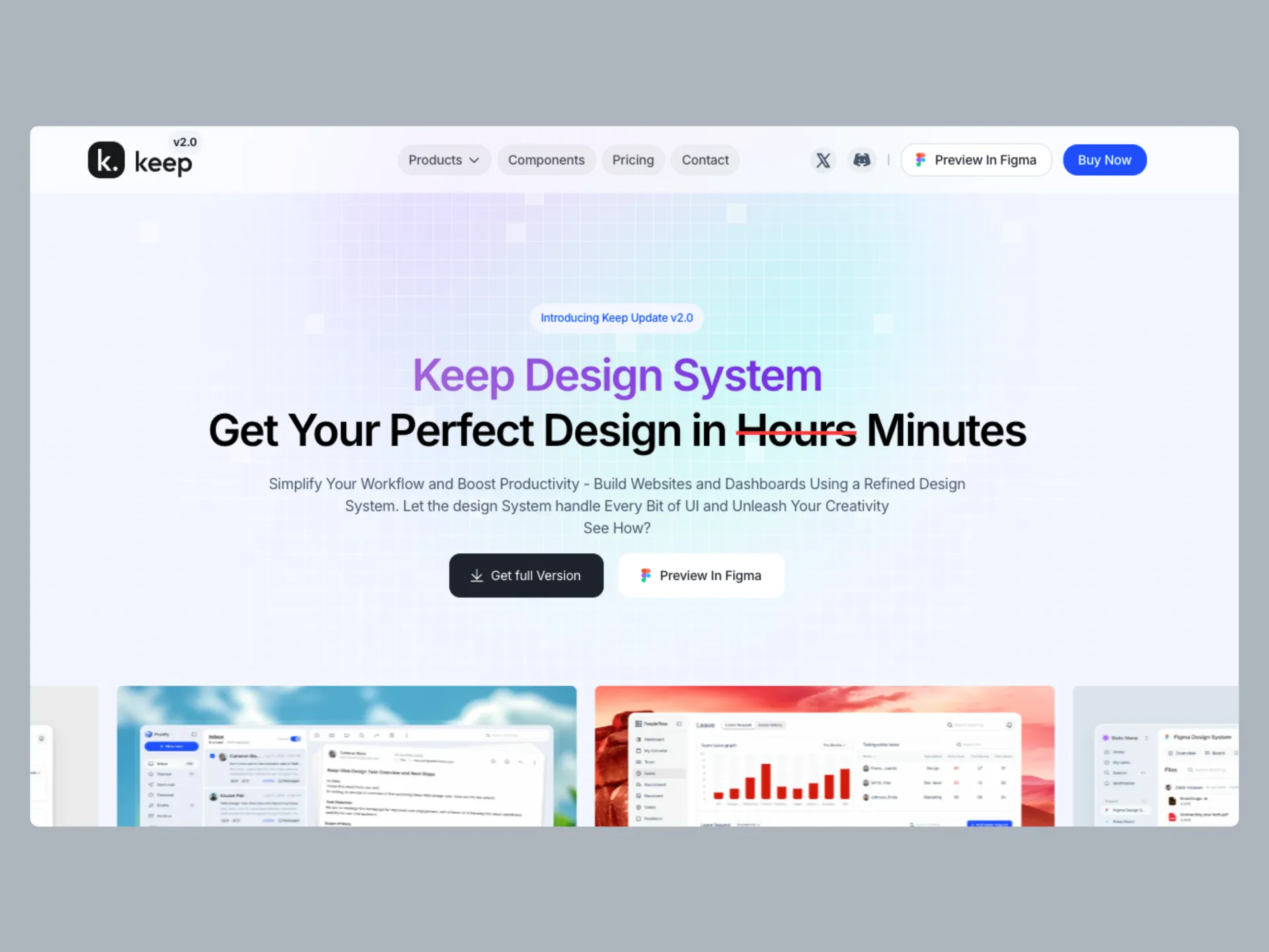
Keep is a Figma design system and matching React component library by StaticMania, launched March 2023 and now on v2.0. It is one of the few kits that keeps both Figma and React libraries in active sync, so design tokens and components in Figma match the code available at react.keepdesign.io
The library includes 10,000+ components and variants, 55+ crafted pages, 200+ blocks, and 5 ready-made templates. Sector-specific dashboards cover Project Management, Mail Application, HR Management, and CRM, with Finance & Banking and E-commerce coming soon. All components use Auto Layout and Figma variables for light and dark modes.
Pricing (one-time payment, lifetime updates):
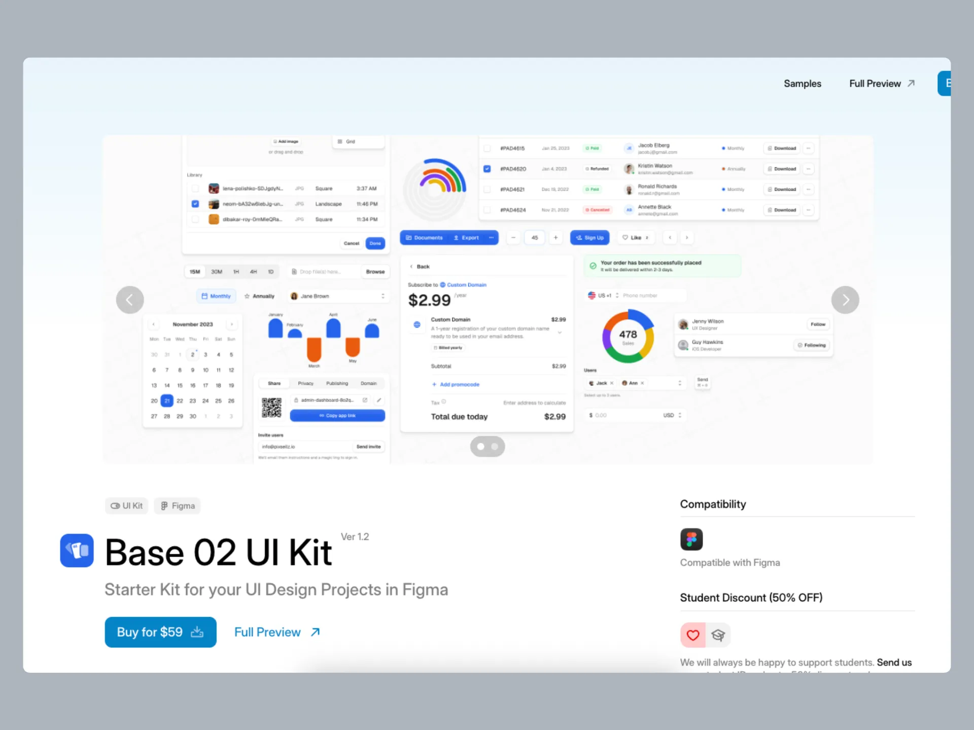
Base 02 is a mid-weight Figma UI kit by Pixsellz, currently on v1.2. Unlike heavier full-scale design systems, Base 02 is positioned as a starter kit: a well-organized foundation for quick UI mockups and simple projects without the overhead of thousands of variants.
The kit includes core UI components, charts, 1,000+ free icons, a 4/8pt grid system, atomic structure, and Figma variables for light and dark modes. Pixsellz also offers a Bundle 2026 that includes Base 02 alongside 23 other kits, templates, and mockups from their catalog.
Pricing (one-time payment):
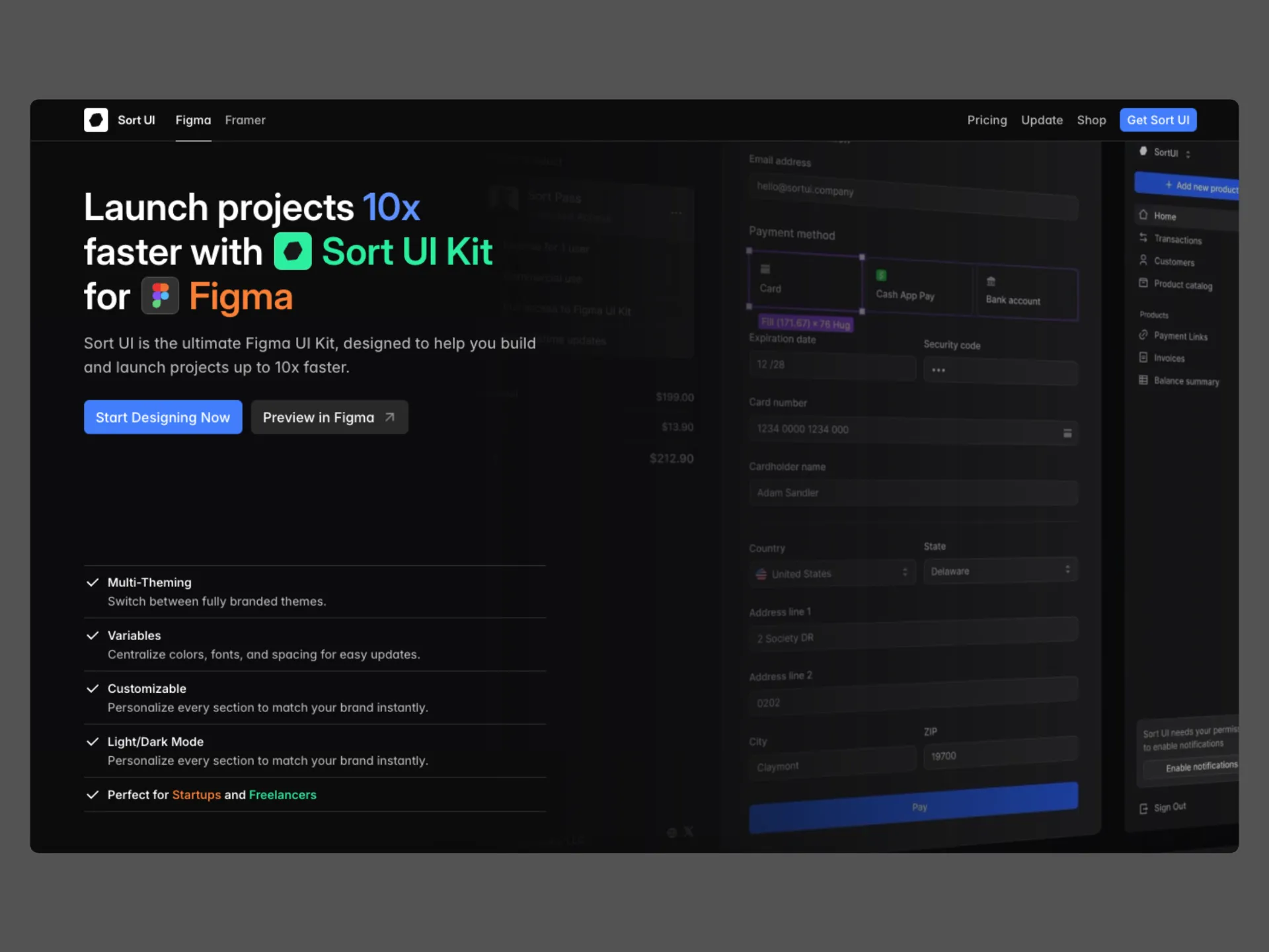
Sort UI is a Figma and Framer UI kit built by Shiryoku (Shiryoku LLC), aimed at SaaS apps, admin panels, and dashboards. Its clearly Notion-inspired aesthetic sets it apart from the more generic SaaS look most kits ship with, and it has a following among founders and freelancers who want to test ideas fast without a template look.
The library includes 2,300+ components, 600+ variables and styles for colors, typography, spacing and radius, multi-theming, light and dark modes, and prebuilt SaaS application templates. All components use Auto Layout and are structured for interactive prototyping.
Pricing (one-time payment, lifetime updates, single user):
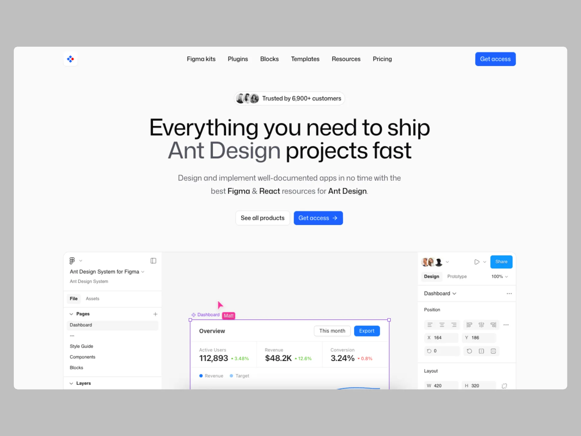
Ant Design for Figma at antforfigma.com is the leading Figma implementation of Ant Design, the most popular React UI library. It is built by Matt Wierzbicki (the same founder behind the shadcn/ui kit for Figma), so the same engineering rigor and one-to-one code alignment applies here. The kit is currently on Ant Design v6, trusted by teams at Meta, Zalando, and eBay, and used by 6,000+ designers.
The ecosystem covers multiple products under one brand: Ant Design System (the main 2,100+ component library), Ant Design Mobile, Ant Design Charts, Ant Design Vue, and AntBlocks UI (React components plus a matching Figma kit). Components use Figma variables, Auto Layout, and component properties, and mirror the original Ant Design JSON tokens so Figma designs and React code stay in sync.
Pricing (Personal License, one-time payment, lifetime access to updates):
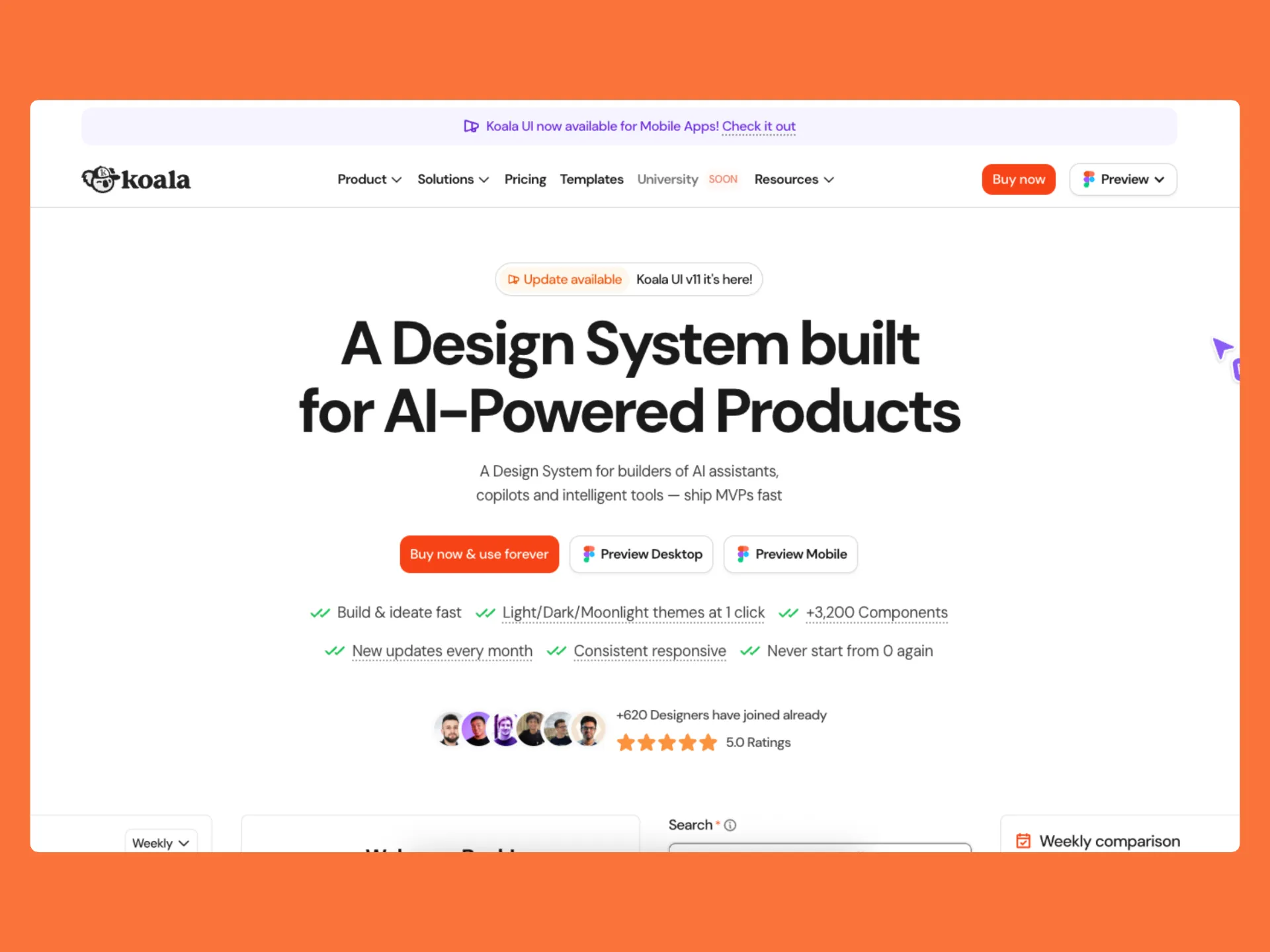
Koala UI is a Figma design system by Jordi Espinosa, launched January 2024. Unlike most SaaS-focused kits, Koala UI is explicitly built for marketing websites, SEO, and conversion optimization, and syncs directly with Webflow using Finsweet's Client-First naming convention. Also available for mobile apps.
The paid library includes 5,000+ components, 210+ marketing sections, and 30+ Dashboard/SaaS templates, all using Auto Layout 5.0 and Figma variables. Four themes ship in the file: Light, Dark, Cream, and Moonlight, with the Cream theme being a genuine differentiator that few other kits offer.
Pricing (one-time payment, lifetime updates):
iOS and iPadOS 26 UI Kit is Apple's official Figma design resource, released alongside iOS 26 and iPadOS 26 following WWDC 2025. The kit is fully overhauled to support the new Liquid Glass design language, so any team designing native Apple apps should treat it as the starting point over any third-party alternative.
The library includes Liquid Glass components, updated control sizes, new layouts and corner radii, refreshed system colors, common controls and views, design templates, text and color styles, materials, and layout guides. Because it comes from Apple directly, components map precisely to UIKit and SwiftUI, eliminating the guesswork about spacing, sizing, or behavior that third-party iOS kits tend to introduce.
.avif)
Material 3 Design Kit is Google's official Figma library for Material Design 3, maintained by Google's design team on Figma Community. Like Apple's iOS kit for iOS designers, this is the canonical starting point for anyone building Android apps or any product following Material conventions. The latest evolution, Material 3 Expressive (May 2025), extends the system with more expressive motion and emphasis patterns.
The kit uses Material 3's token architecture with dynamic color, Figma variables, and component properties. It covers the full component set from navigation to lists to switches, with prototyping wired into interactive components. Because the components are built on the same token system that ships in Android, designs map cleanly to production code with Material Design Components libraries.
%20(1).webp)
Share post


